


Web Design Wednesdays
Scannable Text is User-Optimized Text
So your website's written content is now thoughtfully composed, geared towards SEO, and resizable; are we forgetting anything else? Think about how you read informational content on a website. You don't really read it, do you? You scan it for the most concrete details relevant to what you want or need. If your text is not conducive to being scanned, then you might be inadvertently feeding your bounce rates by frustrating prospective clients who are pressed for time and getting headaches from sifting through huge chunks of writing. I'll explain.
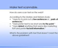
Users scan online text rather than reading it not only because they are in a hurry or have a decreased "Google world" attention span, but for the reason that our eyes tire more quickly when reading off a computer screen rather than a sheet of paper. We also read 25% more slowly, so it is only natural we prefer what we're examining at to cut to the chase. It has also been suggested in an eyetracking study by UseIt that there are even dominant reading patterns that we tend to prefer based on the stages of horizontal and vertical movement when we first encounter web text.
The basic principles of optimizing your site's text for scannability are quite simple. If you just look at our homepage or any of our Los Angeles website design clients' sites, you'll notice general visual commonalities in the written content.
Use short paragraphs instead of plunking a lengthy article. No matter how informative it is, most of your users will not take the time to read the whole thing, namely if they're trying to do preliminary product/provider research.
Convey the core points of your messaging in as few sentences as possible, using active language rather than passive, and do it within the first two paragraphs which is when most users will decide whether or not they are intrigued enough to read on.
Subheads, bullet points, and other separative tools are your friends in outlining and prioritizing what you want to draw users' eyes to. As the UseIt study indicates, we tend to scan in an 'F' shape, so incorporating these features can direct their gaze more efficiently.
P.S. Don't forget to subscribe below to this blog.
 About Jason Ciment
Formerly an attorney and CPA, Jason has been working online since 1997. His columns on affiliate marketing can still be found on www.Clickz.com and his book on search engine optimization can be found at www.seotimetable.com.
This blog is published 4x per week and covers website design and SEO tips as well as a wide range of tips and advice for working and living online more efficiently and enjoyably.
-
Latest Blog Posts
- Top 40 Website Design Fundamentals
- Set up a Google Authorship profile
- How to configure cpanel and mx records to send email confirmations
- "The ‘Big Tall Sandwich’: A Recipe For Winning Online"
- Responsive Web Design: The Future of Website Design or Simply a Trend? Seo Resources
- What is SEO?
- Frequent SEO questions
- Optimization checklist
- Why we're good at SEO
- Web design tips Seo Case Studies
- AbsoluteMed.com
- ArtisanPrecast.com
- GrandpasCoffeeCakes.com