


Blog
Web Design Wednesdays
Published by: 12-19-2012 | POSTED IN: Web Design Wednesdays
Responsive Web Design: The Future of Website Design or Simply a Trend?

With the steady rise in sales of smartphones and tablets, we have noticed a rising trend in requests to design websites that are compatible with these different platforms. 2012 has been a year where we have been introduced to countless new laptops, smartphones and tablets, which each carry their own different screen sizes and resolutions. Why separately design a website for each different screen, when you can design a site that has the ability to instantly adapt to these different devices. The traditional method of website design for each separate platform may soon become a thing of the past with the introduction of Responsive Web Design (RWD).
Through the use of fluid grids, flexible images, and the detection of the type of device that is being used, a responsive web designed site can “respond” to different screen resolutions on different devices. However flexible this type of design may seem, it is not a simple job by any means and will take more time because all these different platforms need to be accounted for in the building process. It is not only the screens that differ in size and resolution, but the method of interaction that has to be accounted for as well. Whether it be a mouse scrolling across a 30-inch PC desktop monitor or a finger swiping across a 7-inch tablet, these factors all play a role in the development and design of a RWD website.
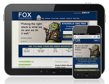
The image above shows Fox Penny Stocks as an example of a website that was separately designed for both PC and mobile platforms. With less real estate on a mobile device, a different layout than the main site must be used, in order to adapt to the different “form factor.” RWD attempts to combine the design work into one adaptable design, which adjusts to any screen, while not sacrificing its functionality and interface.
The Boston Globe is the first major player to jump on the RWD wagon and critics have applauded the change. The Society for News Design has praised their site stating that “The Globe’s responsive design is remarkable and deserves to be noted as one of the key moments in media design history, akin to USA Today’s embrace of color and graphics. Its impact will affect a generation of digital journalists and is an example of what’s possible when smart design and rich content is balanced with a focus on being standards compliant and future-friendly across all platforms.” Another beautifully designed example comes from vodka producer Grey Goose, which also incorporates Parallax Scrolling on top of RWD, which is yet another beautiful trend that we mentioned to look out for in the coming year.
Mobile devices and tablets are not only selling well, but are gaining popularity as the platform of choice when it comes to reading the news and browsing the internet. Is it worth the extra time and money to invest in Responsive Web Design? The ever-evolving world of technology would seem to support that claim, however, it is still too soon to know for sure.
Thanks for reading. Jason.
P.S. Don't forget to subscribe below to this blog.
P.S. Don't forget to subscribe below to this blog.
 About Jason Ciment
Formerly an attorney and CPA, Jason has been working online since 1997. His columns on affiliate marketing can still be found on www.Clickz.com and his book on search engine optimization can be found at www.seotimetable.com.
This blog is published 4x per week and covers website design and SEO tips as well as a wide range of tips and advice for working and living online more efficiently and enjoyably.
Comments
no comments found
-
Latest Blog Posts
- Top 40 Website Design Fundamentals
- Set up a Google Authorship profile
- How to configure cpanel and mx records to send email confirmations
- "The ‘Big Tall Sandwich’: A Recipe For Winning Online"
- Responsive Web Design: The Future of Website Design or Simply a Trend? Seo Resources
- What is SEO?
- Frequent SEO questions
- Optimization checklist
- Why we're good at SEO
- Web design tips Seo Case Studies
- AbsoluteMed.com
- ArtisanPrecast.com
- GrandpasCoffeeCakes.com