


Blog
Web Design Wednesdays
Published by: 02-15-2012 | POSTED IN: Web Design Wednesdays
Don't Let Ads Blind Users to Your Messaging
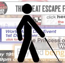
Is your company site or blog displaying an excess of ads, or if you don't accept them does any of your content have the appearance of advertisements? This is important as too many flashy ads, or navigation tools that look like them, can not only put off visitors, it can affect the way their eyes travel across your pages and cause them to miss the content that could lead them to the product or service of yours that would meet their needs. If you look at a few of the homepages of my Los Angeles website design clients, you won't notice any flashing boxes
Putting banners and dialog boxes is unwise not only because of the "content commons" factor, but because of "banner blindess," which refers the physiological reaction our eyes have to this type of information presentation; that is, we steer away from them. This may seem counter-intuitive as the whole point of such features is capture people's attention, but a theory is that in searching for relevant information, users assume that text and hyperlinks are going guide them to pages that inform rather and that boxes will guide them to pages that sell.
An interesting illustration of this theory occurred several years ago with the U.S. Census Bureau's website, which at the time listed the current population in a box in the upper right corner in enormous red letters and numbers. It was found that 86% of visitors complained that they could not find out what the population was. Oddly, in a smaller screenshot of the page, the giant red text was pretty much all you could see, but on an average-sized screen people's eyes just skipped over it because it did not appear to lead to pertinent or trustworthy information.
My advice to avoid this is to keep your links leading to other parts of your site aesthetically consistent with your font and color scheme. Placement on the sidebar keeps them nice and visible but without interfering with navigation menus or making the top of your page look too "busy." If you plan to accept ads, only put a handful up and stick to hyperlinks and text ads as opposed to banners and boxes.
Thanks for reading. Jason.
P.S. Don't forget to subscribe below to this blog.
P.S. Don't forget to subscribe below to this blog.
 About Jason Ciment
Formerly an attorney and CPA, Jason has been working online since 1997. His columns on affiliate marketing can still be found on www.Clickz.com and his book on search engine optimization can be found at www.seotimetable.com.
This blog is published 4x per week and covers website design and SEO tips as well as a wide range of tips and advice for working and living online more efficiently and enjoyably.
Comments
no comments found
-
Latest Blog Posts
- Top 40 Website Design Fundamentals
- Set up a Google Authorship profile
- How to configure cpanel and mx records to send email confirmations
- "The ‘Big Tall Sandwich’: A Recipe For Winning Online"
- Responsive Web Design: The Future of Website Design or Simply a Trend? Seo Resources
- What is SEO?
- Frequent SEO questions
- Optimization checklist
- Why we're good at SEO
- Web design tips Seo Case Studies
- AbsoluteMed.com
- ArtisanPrecast.com
- GrandpasCoffeeCakes.com